HyperJar
Better your relationship with your money.
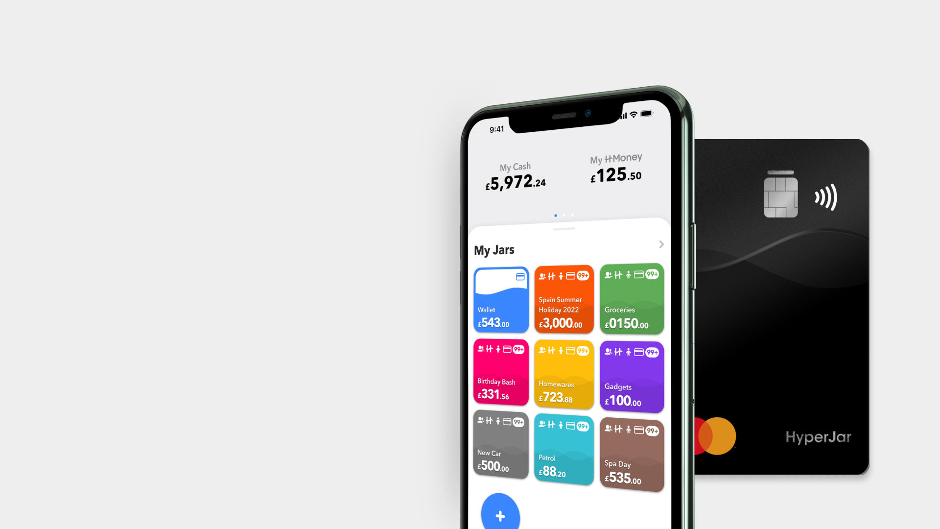
HyperJar is a budgeting app using jars as mini accounts to allocate users income. It aims to help people build a better relationship with their money, promoting save now spend later.
Role
Wireframing, Prototyping, UX Research, UI Design
Tools
Adobe Creative Suite, Figma, Sketch, Invision, Zeplin
Problem
At HyperJar, I found that there were a lot of inconsistencies, such as forms, call to action buttons and overall colour, within the user interface which then made the user experience feel unpleasant. There was no design system in place which meant an opportunity to create reusable components for future designs and clean up the UI and slowly implement design for accessibility. Users were also finding the app readability difficult to read due to bright colours and poorly contrasted text.
Solution
Build a design system to aid future designers and provide more visual consistencies in the UI. Learn behaviours of users through tracking to better flows of features within the app.
Light Mode & Dark Mode
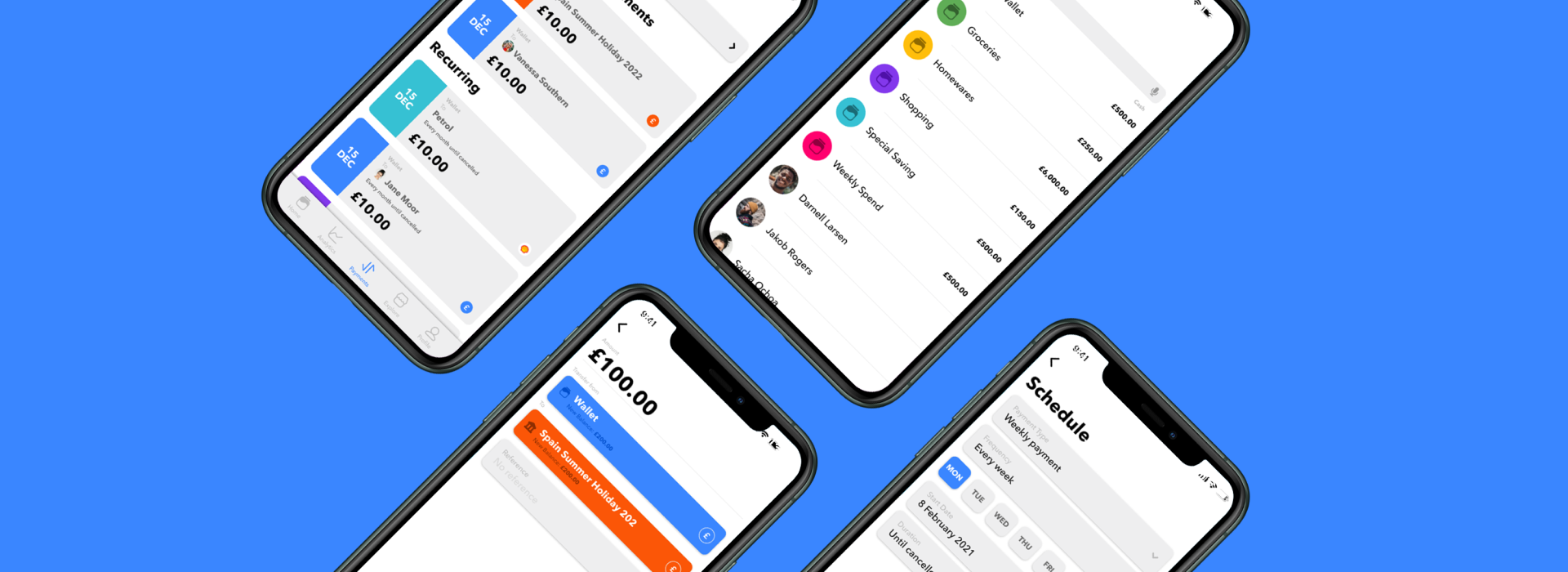
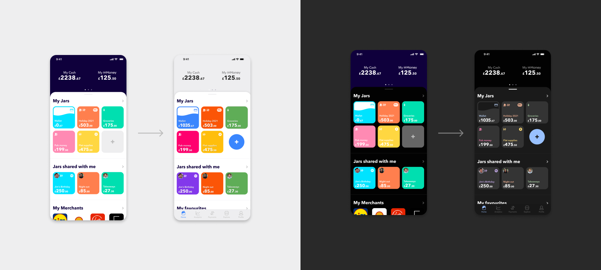
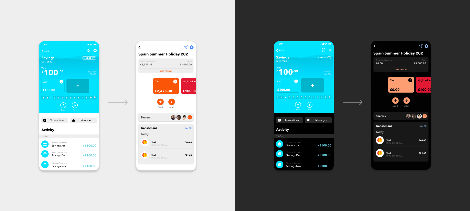
The goal of having dark mode is for accessibility and readability in dark environments. 81.9% of smartphone users use dark mode "as much as they can" which meant for a lot of our users, it would be their native view. The light mode colours didn't follow basic contrast checkers and the saturation doesn't get adjusted for dark mode, which makes it very bright with poor readability in both scenarios.
Overall the palette needed some work with rules assisting the changes from light mode to dark mode. The rules would then pave the way for the design system components to aid the creation of newer screens efficiently.
Rules
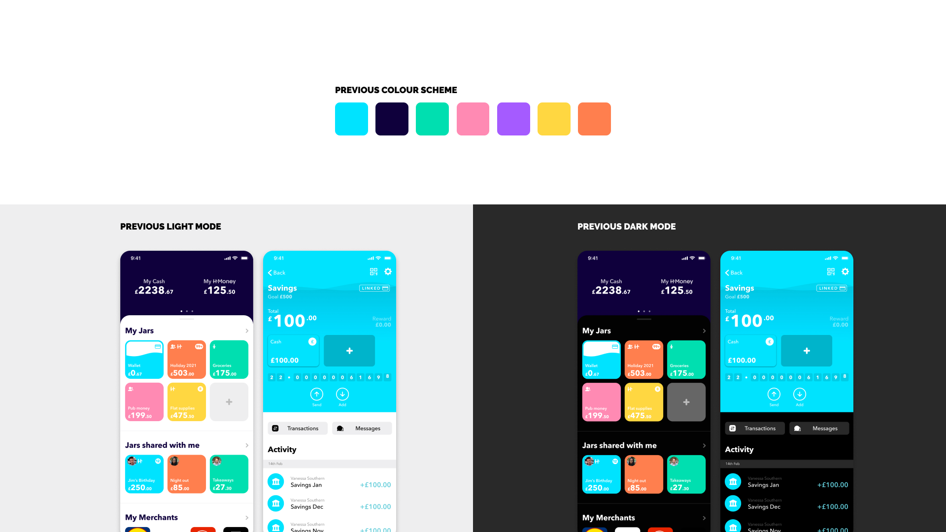
- Background to be white on light mode and black on dark mode.
- Containers will be one shade darker on light mode to its background colour. Dark mode will be one shade lighter, this is to represent depth.
- Dividers will work similarly to containers, depending on their background shade.
- Three styles of body text with different shades of lightness representing the hierarchy of importance. Dark mode works similarly.
- Colours will have a saturated shade for dark mode.
Special Cases
The jars on the homepage will switch in colours, the background of the buttons will become a container shade while the text will be the selected jar colour. This is similar to the material design dark mode guidelines.
Payments
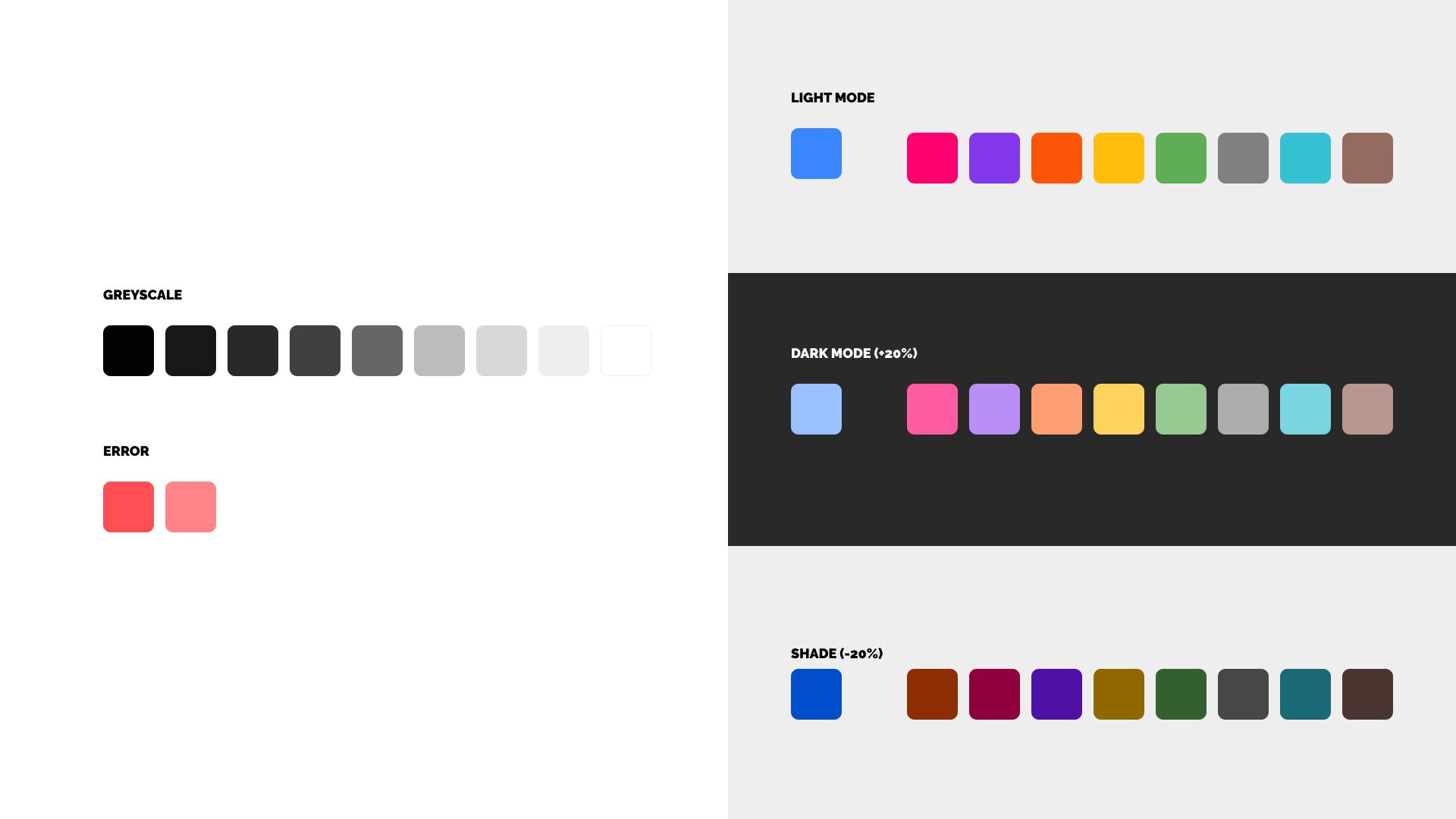
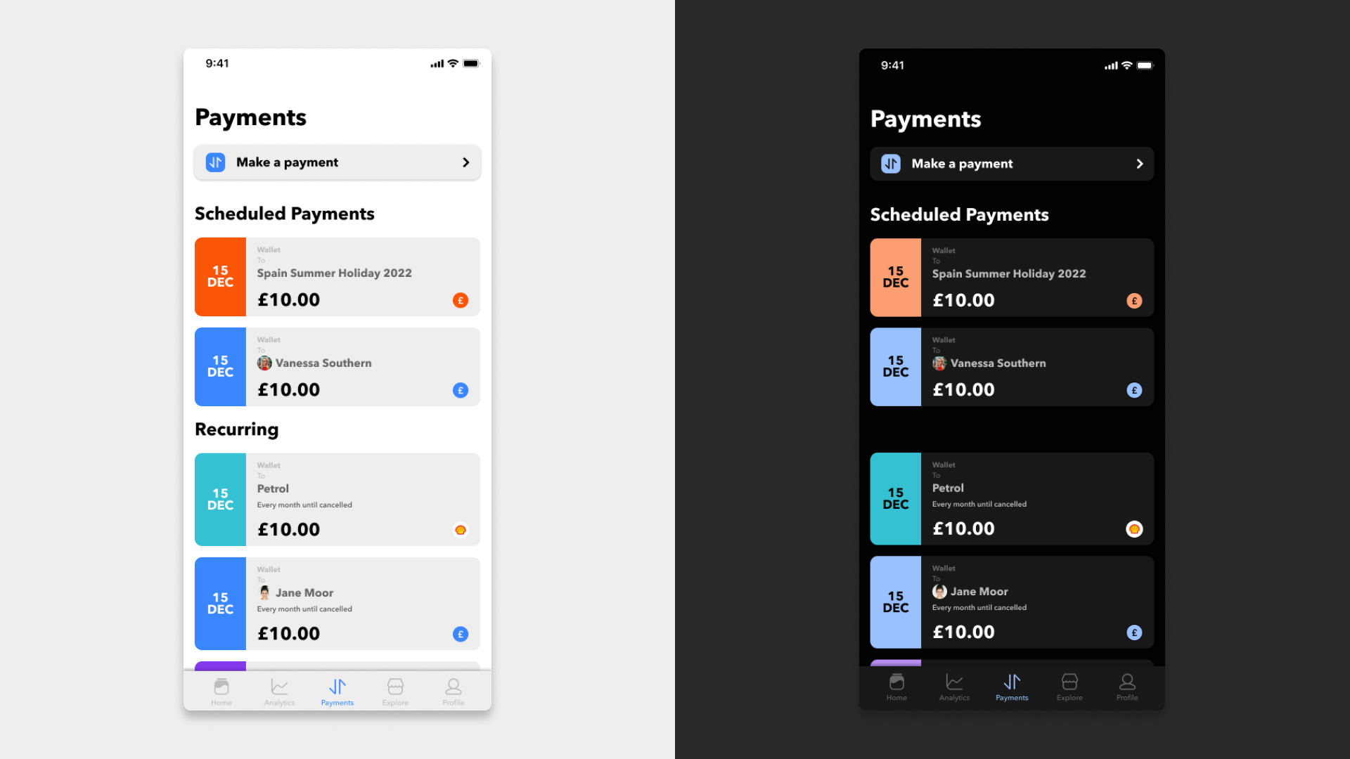
After setting rules for colours and updating the home and jar to the new colours, we started updating features of the app which required some UX attention, while also refreshing the design. An example is the payments feature within the app. As payments already existed within the app, stakeholders wanted an easier way for users to access this as it's a core feature for users to manage their money within the app. In addition, scheduling payments were also something both users and stakeholders wanted in the app, as setting up money transfers can make managing money more autonomous.
Previous Design
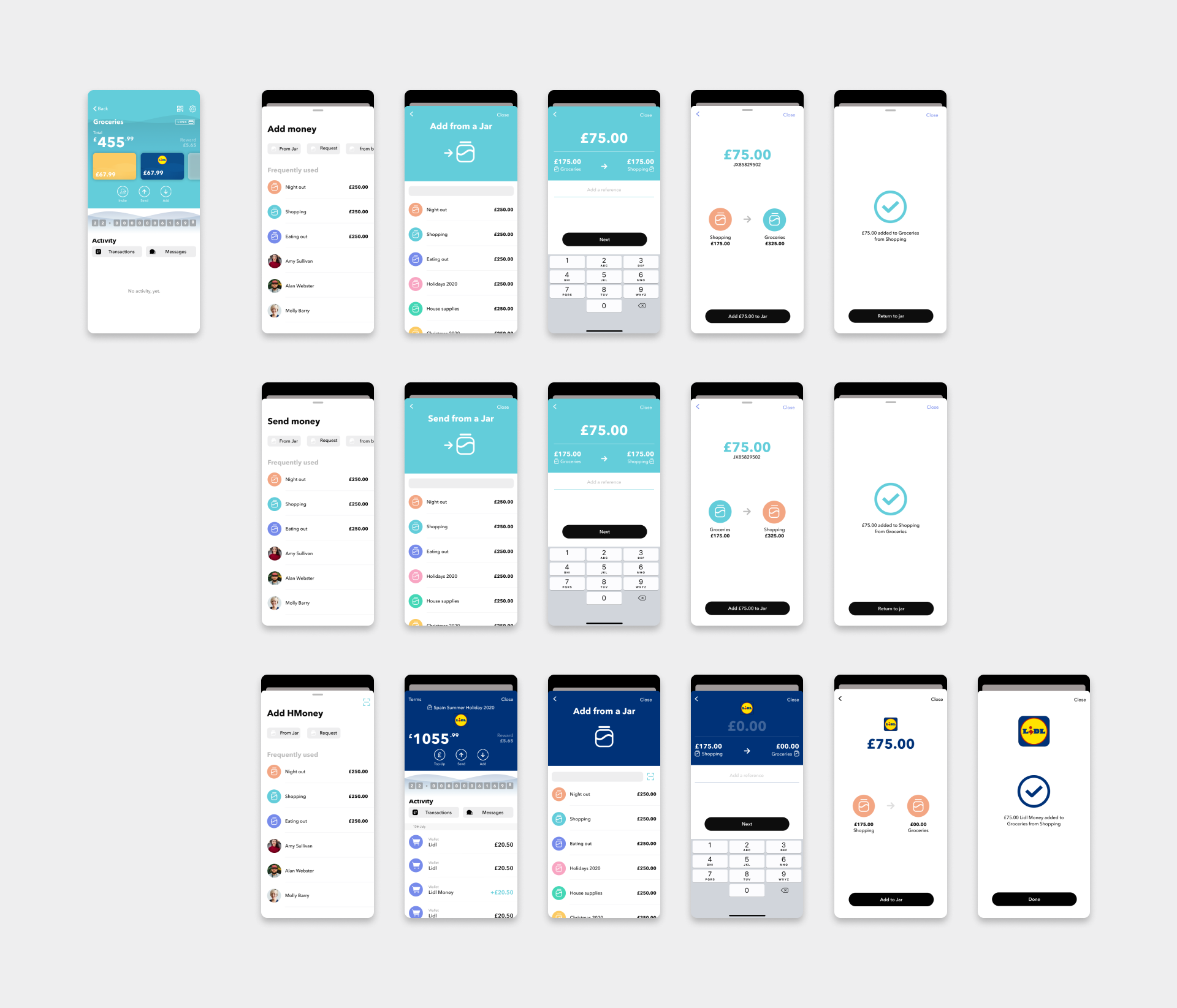
Looking at the previous design there was a lot of potential for clean up, and discussion into making it easier to access. The only way to make a payment was to go into a jar or a merchant or through the friend's list which meant that it was hidden from the top level and users are unaware they could move money within HyperJar.
Within the jar, merchants and friends profile, there were always 2 buttons, "Add" and "Send", these would trigger the payment however the flows did not relate to the jar a user was in, so a user could send or add any money anywhere which felt confusing for a user coming back into the jar after making a payment.
Competitor Analysis
For inspiration on adding a scheduler within HyperJar, competitor analysis was done for major high street banks such as Barclays, Halifax and Natwest but also to newer digital banks including Monzo, Starling and Revolut. The outcome of this showed two possible flows we could use in HyperJar, one being a linear flow where after inputting an amount the schedule can either be set to today or a later date. The second option would be more modular, similar to a form, where a user can go through each option on a top-level screen and selects each part of the form, and adding a schedule if needed.
Wireframes
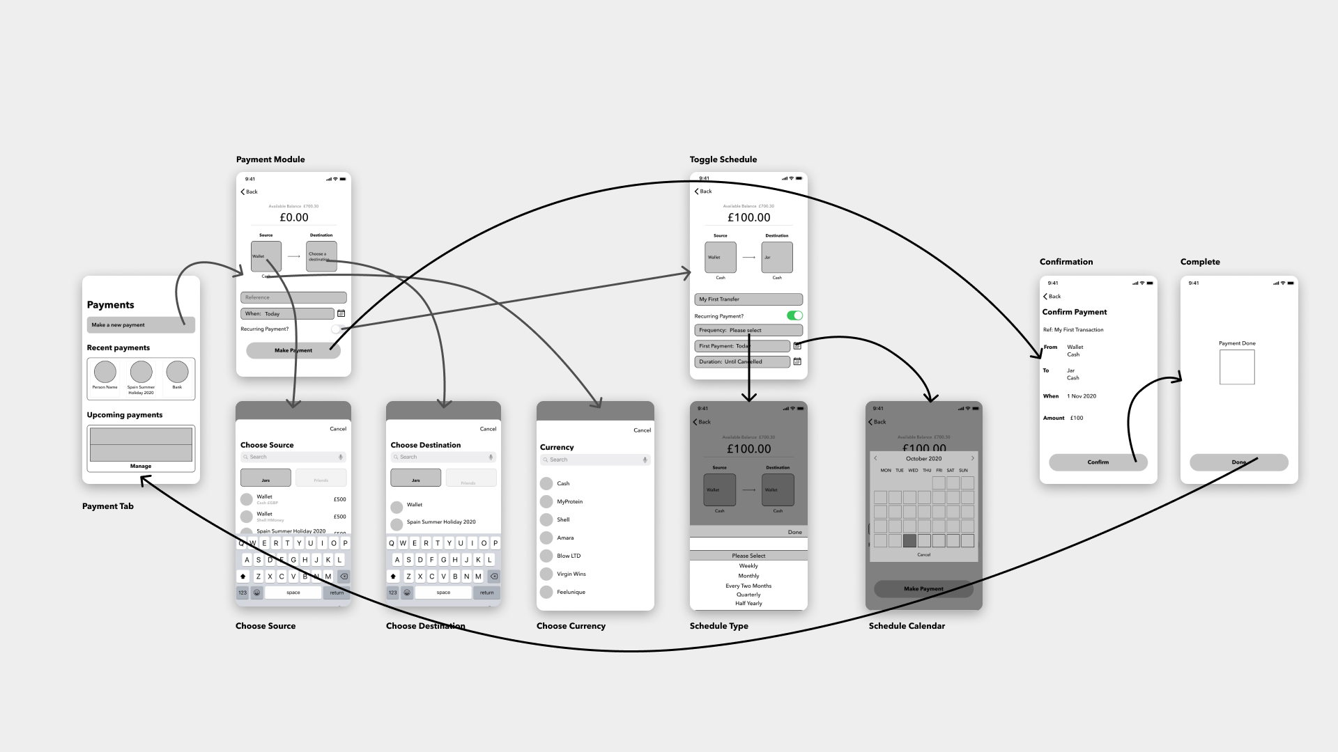
As the current way to make payments were within jars or merchants, a dedicated tab was made for the payments which allowed users to access the feature at the top level of the app, which already reduced the number of clicks to make a payment. The tab also made room for showing scheduled payments and eventually direct debits.
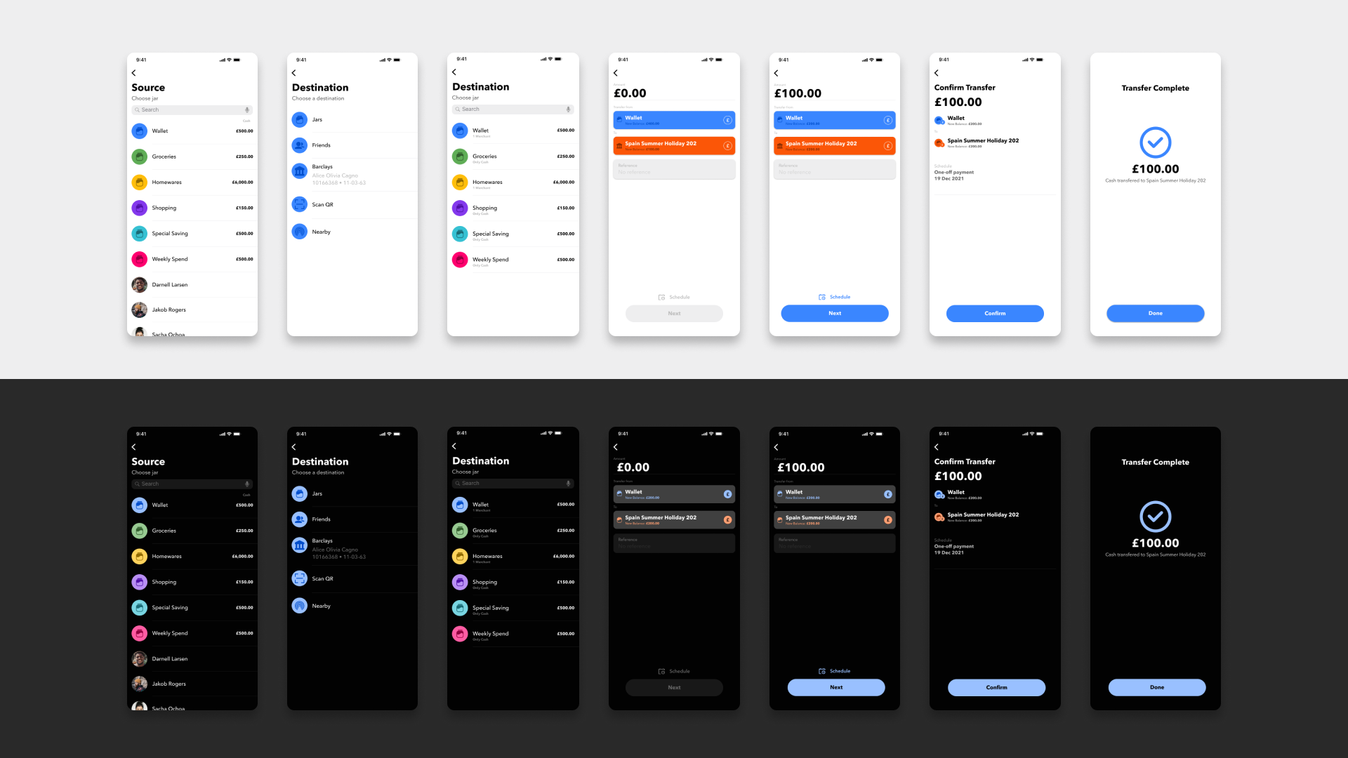
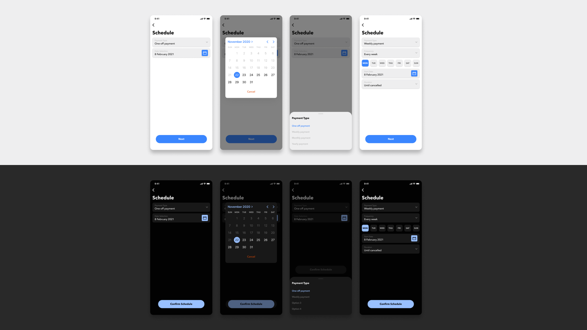
The proposed wireframes followed the second option from the competitor analysis where a user can decide the source, destination and currency of the payment and also toggle the scheduler if the user wanted to make a scheduled or recurring payment.
Final Design
Upon receiving feedback from prototype testing with staff and customer service representatives, we found that as this new module style was a new behaviour, users were getting confused. To solve this we changed the flow to become more linear, similar to the previous design, and also made the input amount page more readable by making each input in a sentence like structure with each row a specific step.
The scheduling CTA also changed into a button that branches off into a different flow so that users that want an instant payment can just press the next button once finishing the amount they want to input.
For buying and moving HMoney, we removed the middle page that a user gets when pressing a merchant card in the jar and opted to keep everything in the merchant's area. This was decided to get rid of an initial step but also help drive users to become customers of those merchants and help users also see what offerings merchants currently have.
Outcome and Reflection
The changes made to the colours were well received by users and team members with lots of positive feedback, especially with dark mode. I found that minor changes to accessibility design have a huge impact on a users experience especially when there is a lot of important information, such as money, that needs to be clear.
Implementing rules for these colours established the base of the growing design system. From this point onwards, updating screens and making components should be a lot more efficient and benefit future designers in knowing how and where to use certain components.
Lastly, there were a couple of challenges with updating the payments functionality. A big challenge was taking something that was already existing and moving it into its independent area within the app. This was challenging as moving money was a core feature of the app and peoples behaviours for sending money were already established, however, given that the solution was to make it more accessible and designed to be more of a step-by-step process should help new and existing users move money effectively. In the future, we hope to make the payments more impactful through user research and understanding users frustrations when moving money across the app.